Here is a new type of chart I made that demonstrate the severity of Covid-19 pandemic in my backyard. The chart is very information-dense, and I have no name for it.
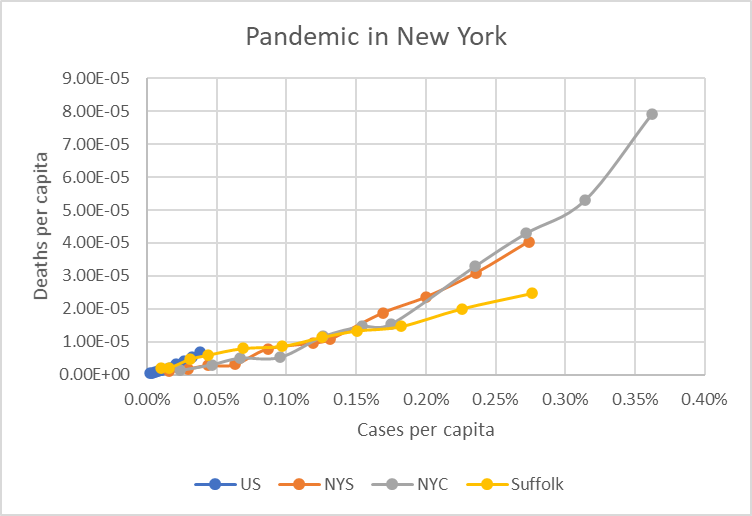
The data are all from March 18-28, for a total of 11 days.
The 4 data series all started from the origin on the lower-left corner, at the beginning of the pandemic. As the days go by, the lines push to the upper-right direction, because both the case and death numbers are cumulative–the best they can do is to stop moving, at the end of the pandemic. In the exponential growth period, the distance between neighboring points expand as the lines move to the right. The angle of each point from the horizontal axis is the death-to-case ratio.
What can we see from this chart?
- New York City has about 10 times the cases and deaths, compared to the nation. It is the indisputable epicenter of the US epidemic.
- Our county, Suffolk, has about the same cases per-capita as the state, but both are much higher than that of the US average.
- Our county has a bit lower death rate (per case). There could be multiple explanations. Maybe we are testing more thoroughly. Or maybe while the death count is low, statistical variance is high.
- In contrast, NYC has the worst death rate, but it was better only a few days ago. It may be an indication that the hospitals are overwhelmed, which is very disheartening.
- The case numbers are doubling roughly every 3.5 days for NYS, NYC and Suffolk county.